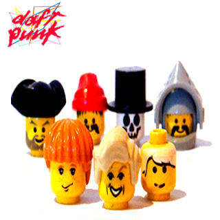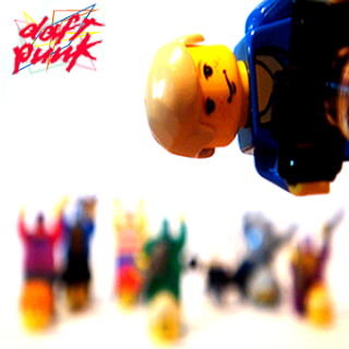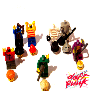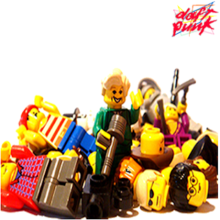


I now require audience feedback to decide which is most:
- Aesthetically pleasing
- Most appropriate for purpose.
- Most attractive and liked by my target audience.
- Uses a different shot type than that of my cover and back cover of my Digi-Pack.
- Which design is most authentic yet original at the same time?
Please leave comments and suggestions in terms of these target questions above as it will enable me to produce a more effective product which is direct to my target audience not my own personal preference or use the Questionnaire bellow which have more promotes.
Media Studies A2 Advanced Portfolio Questionaire Review On Promotionl Products Four
View more documents from jessicasquires.
This is my first mock up of my inside sleeve and CD spine, however I am not entirely happy with there outcome as I believe there is a missing element on both products yet desire input to improve this,so please leave your suggestions bellow.


The main criticisms were applicable to both products:-
- There is a lack of the presence of the unique selling point of the product , the Lego men.
- There isn't enough information on the inside sleeve to be sustainable for the coloured lines to compensate.
- The right hand corner of the inner sleeve needs something interesting eg. Lego to distract away from the empty space.
Positives
- Clever use of intertextuality eg. the logo, the coloured lines inspired from the logo.
- The typeface size is in proportion for both products and is clear.
- The information is useful and necessary to such products.
- The colours used are bright and exciting and reflect the genre of the music.
No comments:
Post a Comment